Subscribe


maps

Maps / 1 week ago
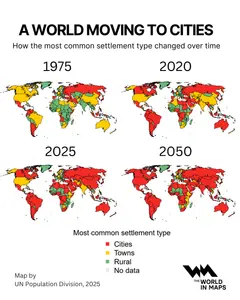
How cities became the world's dominant home
Over the past half-century, the world has steadily shifted from farms and villages to towns and, increasingly, to cities. The image above, based on data from the UN Population Division, captures that shift clearly: what was once a largely rural planet in 1975 is fast becoming an urban one, with cities set to dominate by 2050. Over the past half-century, the world has steadily shifted from farms and villages to towns and, increasingly, to cities. The image above, based on data from the UN Population Division, captures that shift clearly: what was once a largely rural planet in 1975 is fast becoming an urban one, with cities set to dominate by 2050. In 1975, much of Africa, Asia, and parts of Latin America were still predominantly rural. According to the United Nations, only about 38% of the global population lived in urban areas at the time.
Maps / 1 week ago
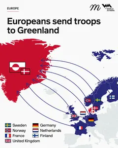
European troops arrive in Greenland as Arctic tensions spike amid U.S. pressure
Several European nations have begun to deploy military contingents to Greenland. The moves are part of a broader effort to reinforce Arctic security, demonstrate solidarity with Denmark and Greenland, and signal collective resolve in the face of renewed pressure from the United States over control of the strategically vital island. Several European nations have begun to deploy military contingents to Greenland. The moves are part of a broader effort to reinforce Arctic security, demonstrate solidarity with Denmark and Greenland, and signal collective resolve in the face of renewed pressure from the United States over control of the strategically vital island. The deployment of small numbers of troops and reconnaissance teams from Sweden, Norway, France, the United Kingdom, Germany, the Netherlands, and Finland forms part of Operation Arctic Endurance, a Danish-led military exercise in Greenland aimed at strengthening defence cooperation within NATO’s northern flank.
Maps / 1 week ago
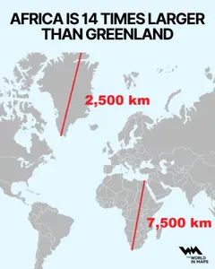
Africa vs Greenland: The continent is really 14 times bigger than you think
On many world maps, Greenland and Africa can look almost the same size. But the reality is very different. On many world maps, Greenland and Africa can look almost the same size. But the reality is very different. Africa covers an enormous area of around 30.3 million square kilometres, making it the second-largest continent on Earth after Asia. Greenland, by contrast, is the world’s largest island but only roughly 2.16 million square kilometres in total land area. That means Africa’s landmass is roughly 14 times larger than Greenland’s.


Maps / 6 weeks ago
Countries with populations above 100 million
Only 14 countries have crossed the 100-million threshold, and together they represent more than half of the world’s 8.1 billion people, according to the United Nations Population Division. Only 14 countries have crossed the 100-million threshold, and together they represent more than half of the world’s 8.1 billion people, according to the United Nations Population Division. These nations include China, India, the United States, Indonesia, Pakistan, Nigeria, Brazil, Bangladesh, Russia, Mexico, Ethiopia, Japan, the Philippines, and Egypt, an eclectic mix of economic powerhouses, emerging markets, and developing nations that collectively influence global decisions on trade, climate, security, and migration.
Maps / 6 weeks ago
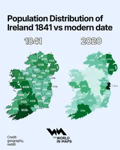
Ireland’s population map reveals a dramatic shift from 1841 to now
Ireland’s shifting population landscape has returned to global attention after a new comparative map reveals how dramatically the island’s demographic profile has changed since the mid-19th century. Ireland’s shifting population landscape has returned to global attention after a new comparative map reveals how dramatically the island’s demographic profile has changed since the mid-19th century. The visual, which differs from census data from 1841 with figures from 2020, highlights what historians and economists describe as one of Europe’s most significant population transformations, rooted in famine, migration and the long-term pull of urban growth.